In early 2009, California-based designer Richard Kramer met Slow Art Day founder Phil Terry in New York while attending the Gel conference. Richard took an immediate interest in Slow Art Day and offered to join the volunteer effort to grow the movement. After the meteoric growth of Slow Art Day over the next two years, Phil knew it was time to create a new logo and website to facilitate and support the goal of growing to thousands of events around the world. Given Richard’s background in design and digital media, he was a perfect fit for the job.
The process of designing the logo was a truly collaborative effort between Phil and Richard. Phil wanted something that communicated the many facets of Slow Art Day: art, global, community, grassroots, and slowing down. He knew the logo needed to become an instantly recognizable mark that would translate across all types of media. But how do you capture the abstract concept of slowly looking at art in a single visual image?
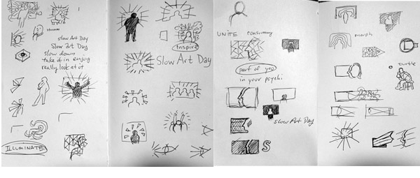
Richard began by exploring a few concepts that centered on people looking at and engaging with art and the emotions that come with it. Here is a sample of first sketches:
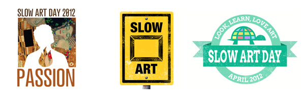
After further discussion and collaboration, Richard took these initial sketches and created three distinct logos:
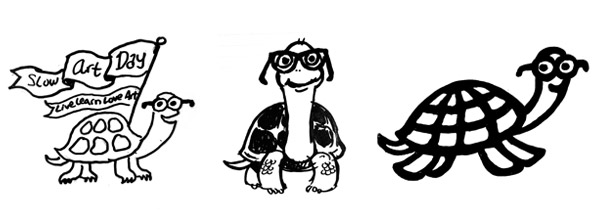
Immediately, the iconized turtle in the far right logo caught Phil’s attention. Not only was the turtle a unique and easily recognizable image, it held kinship with the Slow Food Movement, which uses a snail in their logo. Richard began to explore options with the turtle including the iconized and character sketches below:
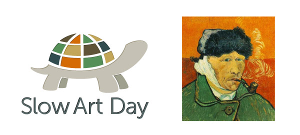
Once they settled on the image, it was time to select a meaningful color palette. Phil solicited help from his wife, Lisa Dombrow, whose lifelong love of art and her slow-looking practice originally inspired him to start Slow Art Day. Together with Richard, they chose a palette from the Vincent Van Gogh painting, “Self-Portrait with Bandaged Ear and Pipe (1889).” They thought the color palette from Van Gogh counter-balanced the whimsy of the iconized turtle and brought more serious attention to the practice of looking at and loving art, while the shape of the turtle’s shell evoked the global nature of the movement.
The new logo was launched with the revised website and in time to support Slow Art Day 2012, on April 28th. We look forward to it becoming a recognized global image as the Slow Art Day movement continues to grow.


